File Size: 228KB
Total Views: 1
Date Created:
Last Modified Date:
Official Website: Go to website
License: MIT
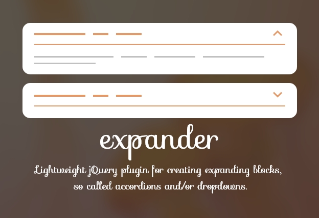
Expander is a very lightweight and easy to implement jQuery plugin for accordion that creates simple accordions and dropdowns very easily. The styling of the accordion is fully controlled with CSS so you can change/modify its appearance easily with the help of the CSS. Expander can be used as a dropdown.
Features:
- Lightweight and easy to implement.
- Supports on all modern devices and browsers.
- Expander can be used as a dropdown.
- Supports various types of Callback(onOpen, onClose, onToggle, onInit).
How to use it:
1. Include the Javascript jquery.expander.min.js at the bottom of the web page.
<script src="path/to/jquery.expander.min.js"></script>2. Include the CSS jquery.expander.min.css in the header of the page.
<link rel="stylesheet" href="path/to/jquery.expander.min.css">3. Add the basic HTML to the page.
<div class="accordion default" data-expander="my-class">
  <div class="accordion__head" data-toggle>First Item</div>
  <div class="accordion__body" data-body>
    Here's more info. Click heading again in order to close this content.
  </div>
</div>
<div class="accordion default" data-expander="my-class">
  <div class="accordion__head" data-toggle>Second Item</div>
  <div class="accordion__body" data-body>
    Here's more info. Click heading again in order to close this content.
  </div>
</div>
4. Initialize the plugin and we’re ready to go.
$('.default').expander();Customize
$('.accordion').expander({
  toggle: '.accordion__head',
  body: '.accordion__body',
  class: 'my-class',
});
Customize data attributes at HTML
<div class="accordion" data-expander data-animationDuration="150" data-opened="false">
  ...
</div>
Plugin’s default options:
$.fn.expander.defaults = {
  // Initial state of the expander
  opened: false,

  // Expander's connection with other expanders.
  // Used in order to create accordion.
  class: false,

  // Whether user can close the expander clicking on it's `toggle` or `close` elements.
  // Note: If it's an accordion, expanding other accordion elements still will be able to close it.
  closeable: true,

  // Whether to prevent default action clicking on `toggle`, `open` or `close`.
  // For example if it's a link, and default action is prevented browser won't open the link.
  preventDefault: true,

  // Callback will be fired when expander is opened.
  // Gets two arguments: event and expander (object with methods and options connected to the expander)
  onOpen: null,

  // Callback will be fired when expander is closed.
  // Gets two arguments: event and expander (object with methods and options connected to the expander)
  onClose: null,

  // Callback will be fired when expander is toggled.
  // Gets two arguments: event and expander (object with methods and options connected to the expander)
  onToggle: null,

  // Callback will be fired once expander is loaded.
  // Gets one arguments: expander (object with methods and options connected to the expander)
  onInit: null,

  // Speed of open/close animation
  animationDuration: 300,

  // Elements that will be shown/hidden
  // Can be: single selector, array of selectors, single element, array of elements, jQuery collection
  body: [],

  // Elements that will toggle shown/hidden states
  // Can be: single selector, array of selectors, single element, array of elements, jQuery collection
  toggle: [],

  // Elements that will toggle to shown state
  // Can be: single selector, array of selectors, single element, array of elements, jQuery collection
  open: [],

  // Elements that will toggle to closed state
  // Can be: single selector, array of selectors, single element, array of elements, jQuery collection
  close: [],

  // Whether expander is a dropdown (considered as completely different mode).
  dropdown: false,
};


