File Size: 129KB
Total Views: 2347
Date Created:
Last Modified Date:
Official Website: Go to website
License: MIT
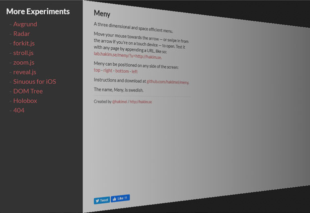
Meny is CSS3 enabled three-dimensional sidebar menu plugin, supports all of the modern browsers. Automatically convert to touch events for mobile devices. Very easy to use and lightweight.
Features:
- Very simple and lightweight.
- Supports touch events on mobile.
- Supports CSS3 transforms.
How to use it:
1. Include the Javascript meny.js at the bottom of the web page.
<script src="/path/to/meny.js"></script>2. Include the CSS demo.css in the header of the page.
<link rel="stylesheet" href="css/demo.css">3. Add the basic HTML to the page.
<div class="meny">
  <!-- your menu items -->
</div>
  <div class="contents">
<!-- your page contents -->
</div>
4. Initialize the plugin and we’re ready to go.
var meny = Meny.create({
	menuElement: document.querySelector( '.meny' ),
	contentsElement: document.querySelector( '.contents' ),
});
Plugin’s default options:
var meny = Meny.create({
	menuElement: document.querySelector( '.meny' ),
	contentsElement: document.querySelector( '.contents' ),
	position: 'left',
	height: 200,
	width: 260,
	angle: 30,
	threshold: 40,
	overlap: 6,
	transitionDuration: '0.5s',
	transitionEasing: 'ease',
	gradient: 'rgba(0,0,0,0.20) 0%, rgba(0,0,0,0.65) 100%)',
	mouse: true,
	touch: true
});| Parameter | Default | Description |
|---|---|---|
menuElement |
|
The element that will be animated in from off screen |
contentsElement |
|
The contents that gets pushed aside while Meny is active |
position |
‘left’ | The alignment of the menu (top/right/bottom/left) |
height |
200 | The height of the menu (when using top/bottom position) |
width |
260 | The width of the menu (when using left/right position) |
angle |
30 | The angle at which the contents will rotate to. |
threshold |
40 | The mouse distance from menu position which can trigger menu to open. |
overlap |
6 | Width(in px) of the thin line you see on screen when menu is in closed position. |
transitionDuration |
‘0.5s’ | The total time taken by menu animation. |
transitionEasing |
‘ease’ | Transition style for menu animations |
gradient |
|
Gradient overlay for the contents |
mouse |
true | Use mouse movement to automatically open/close |
touch |
true | Use touch swipe events to open/close |
API & Events
meny.configure({ mouse: false }); // change settings after initialization
meny.open();
meny.close();
meny.isOpen(); // true/false
meny.destroy(); // revert original DOM state, unbind events
The wrapper element (parent of the menu and contents) is decorated with classes based on its state:
.meny-active{}
.meny-top{}
.meny-right{}
.meny-bottom{}
.meny-left{}
Instances of Meny dispatch events to notify you of their state:
var meny = Meny.create( ... )

meny.addEventListener( 'open', function() {
	// do something on open
});

meny.addEventListener( 'close', function() {
	// do something on close
});

meny.addEventListener( 'opened', function() {
	// do something right after meny is opened and transitions finished
});

meny.addEventListener( 'closed', function() {
	// do something right after meny is closed and transitions finished
});


